

GENERAL CONTRACTING VISUAL IDENTITY
Backdraft Builders
OVERVIEW
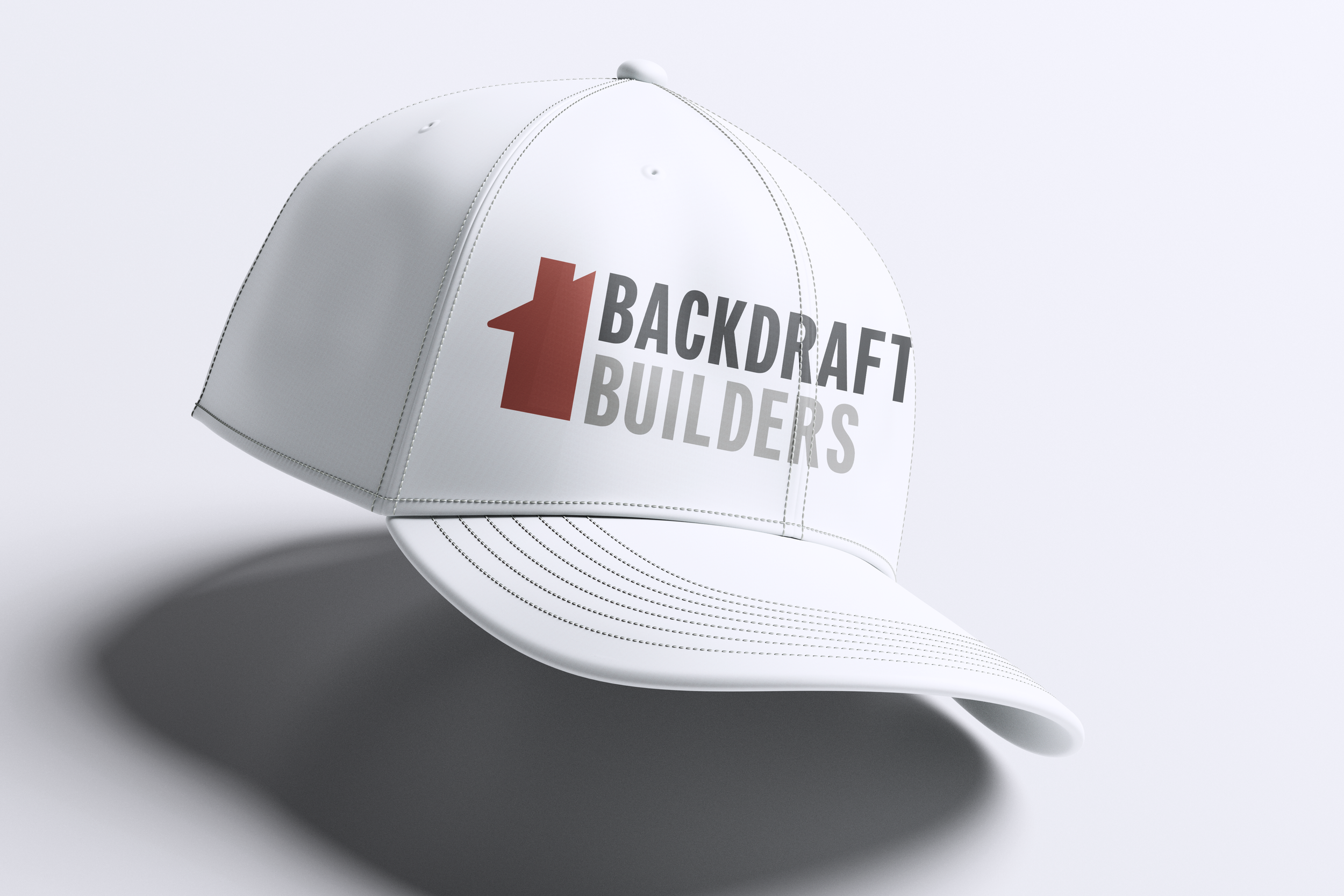
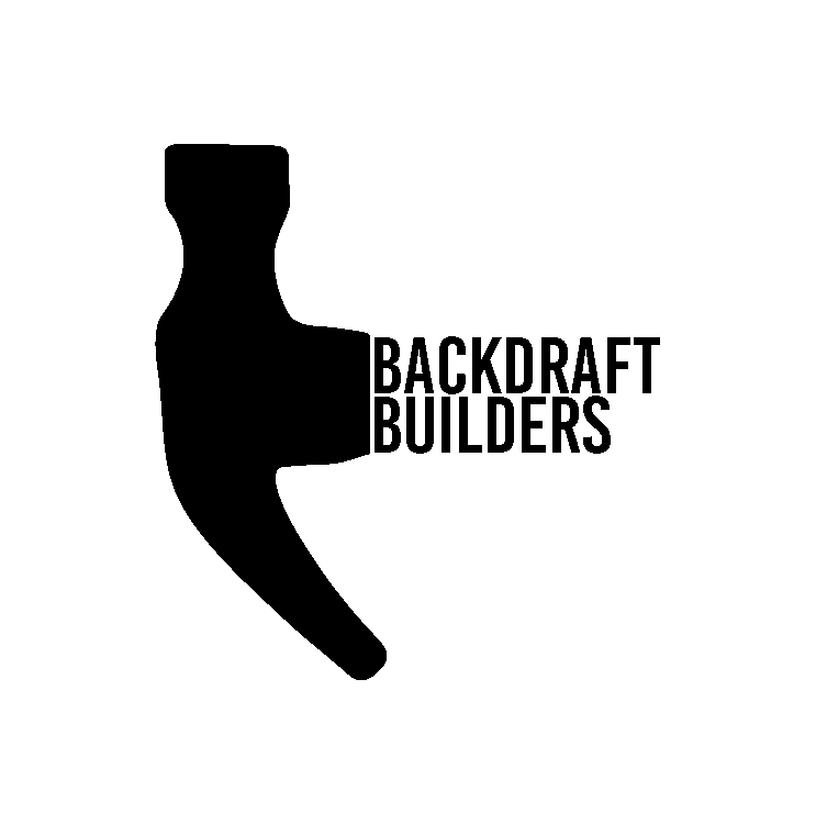
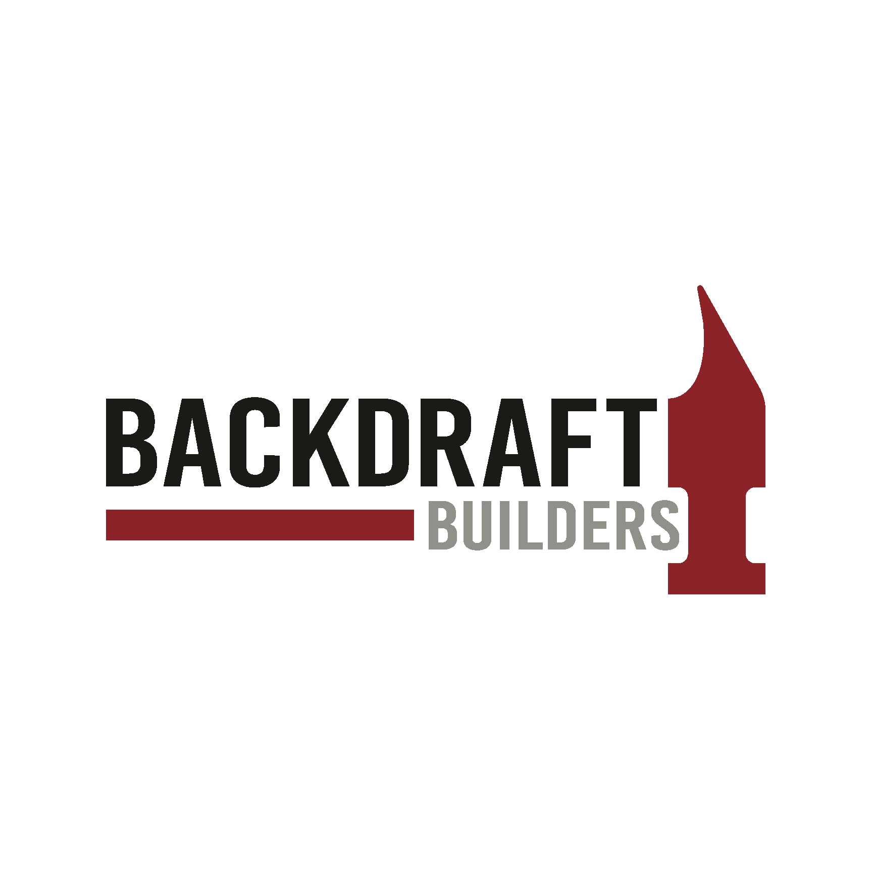
Backdraft Builders is a local contracting business that offers general contracting and home improvements. On their 1st anniversary, they asked me to elevate the brand's visual identity to reflect its discipline and integrity. The new logo features a red house silhouette, symbolizing the importance of fire safety and core values. The logotype is a thick condensed modern typeface. The result is a more sophisticated and mature brand aesthetic that reflects the history of public service, and willingness to help others.
SERVICES
Creative Direction
Visual Identity Design
Logo Redesign
Signage
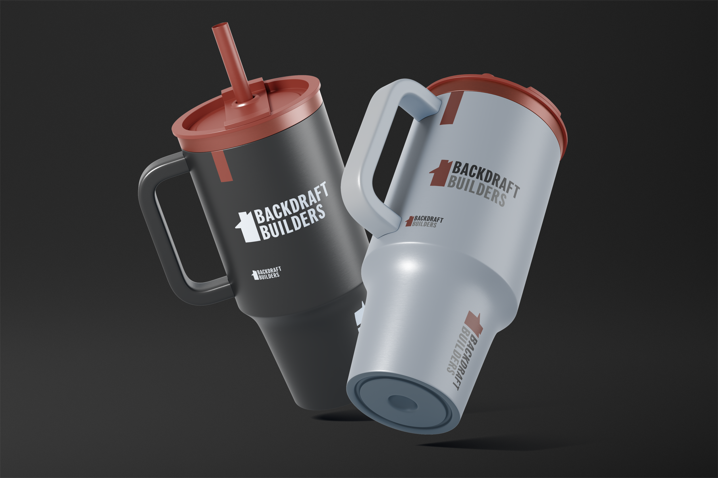
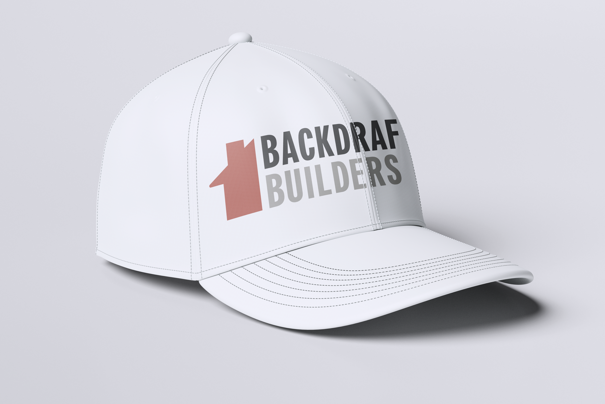
Packaging Handouts

Early sketches.


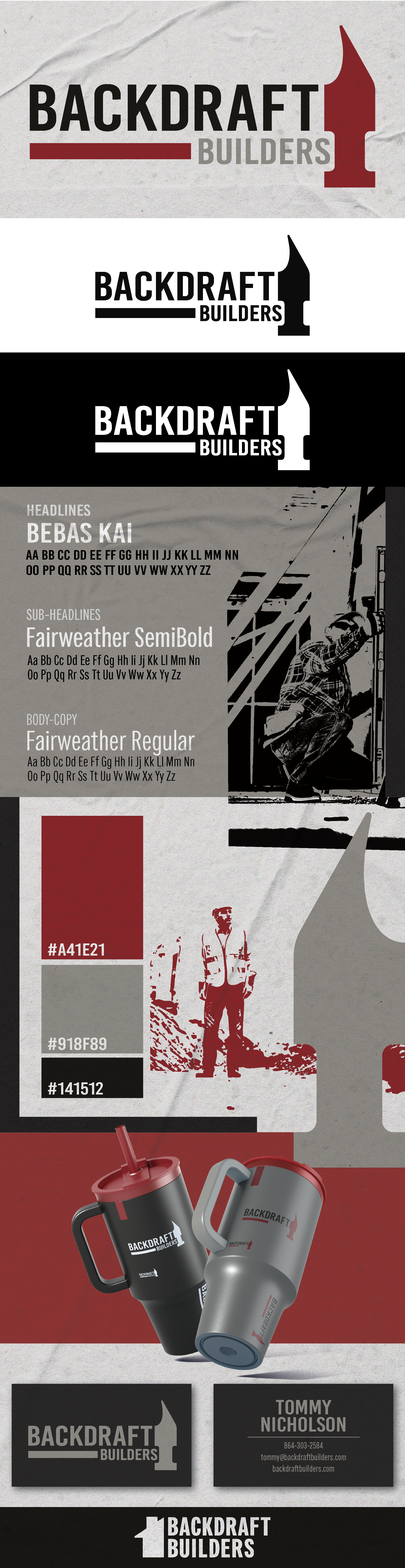
Style Guides
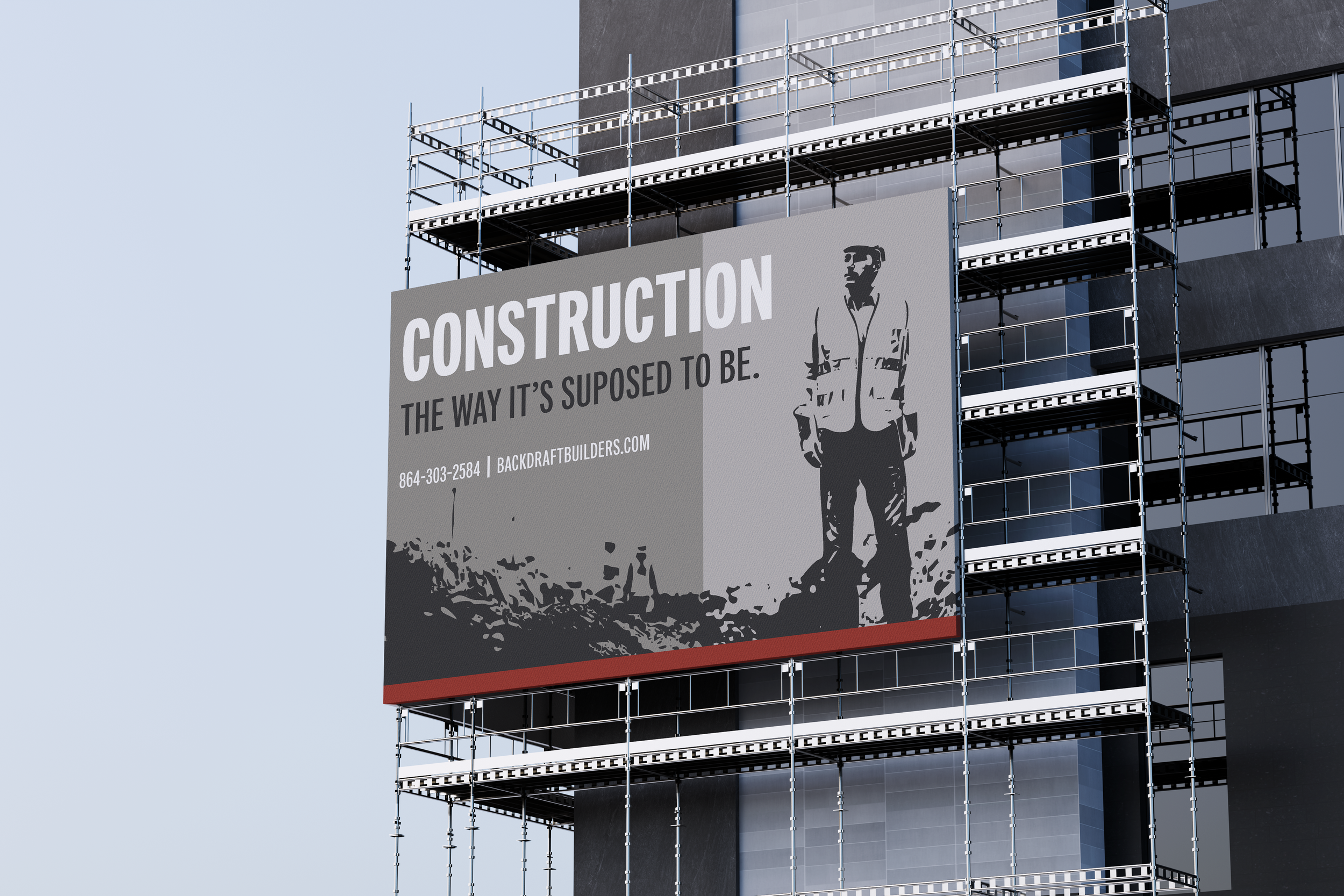
The first style guide was constructed in the brutalist style. Paper textures and minimal colors were used to achieve this appearance. Along with that, all images of workers were turned into thresholds to contribute to the style. This version, including the logo was not selected due to the brutalist look not fitting the overall tone of Backdraft Builders. The tone was reevaluated and a new style guide was then constructed (see below).

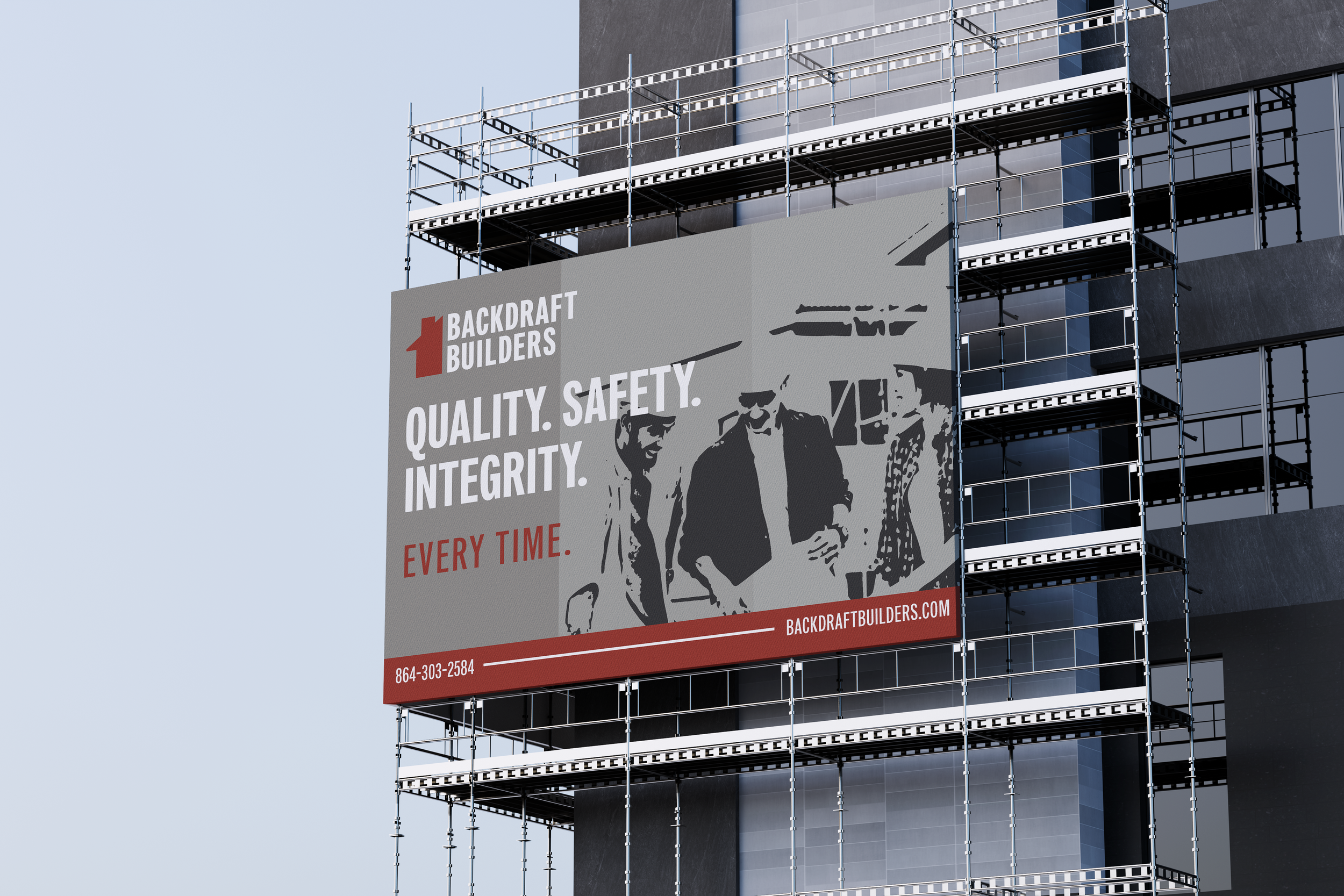
The tone of the second style guide was loosely inspired by the brand guides of European soccer clubs. The paper texture were still included because it fit the tone of general contracting. Diamond shapes were introduced during in this style guide that were then included in further mockups (see below). Images were left unchanged in this version to provide a sense of clarity of what is being done. The threshold effect was reintroduced in proceeding mockups (see below).